A New UI for the PlayCanvas Editor
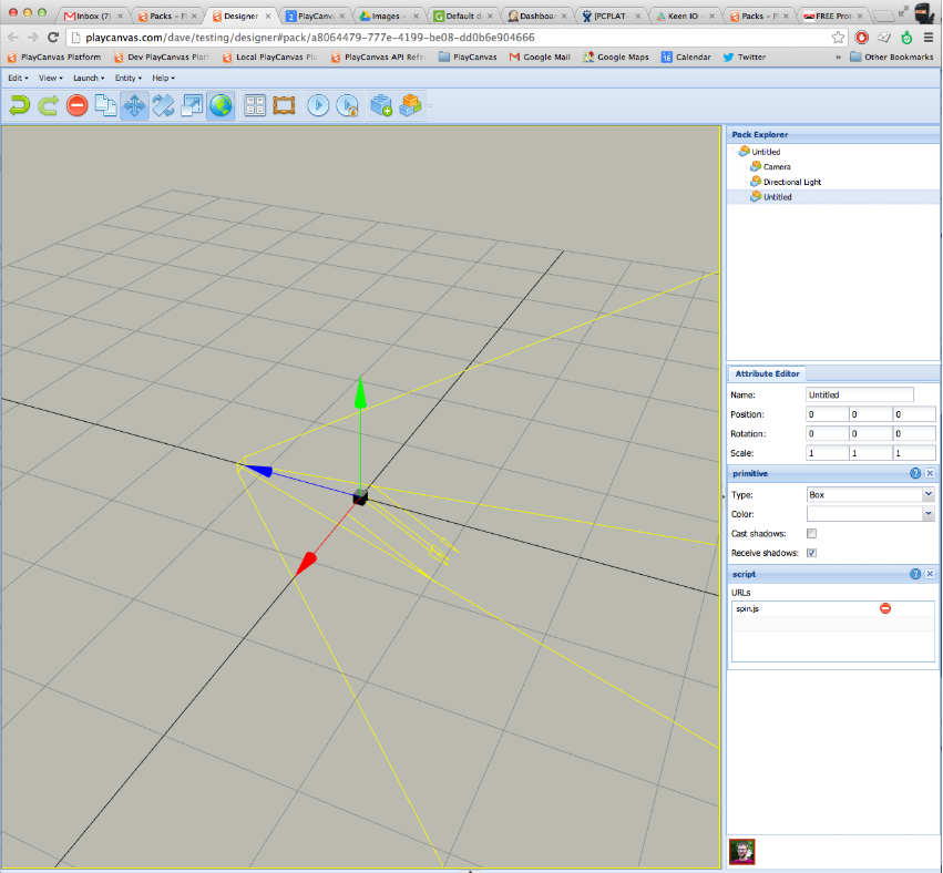
The PlayCanvas Editor has been around since 2011. Way back then, it was called the PlayCanvas Designer. It was built on Sencha's ExtJS front end framework and looked like this:
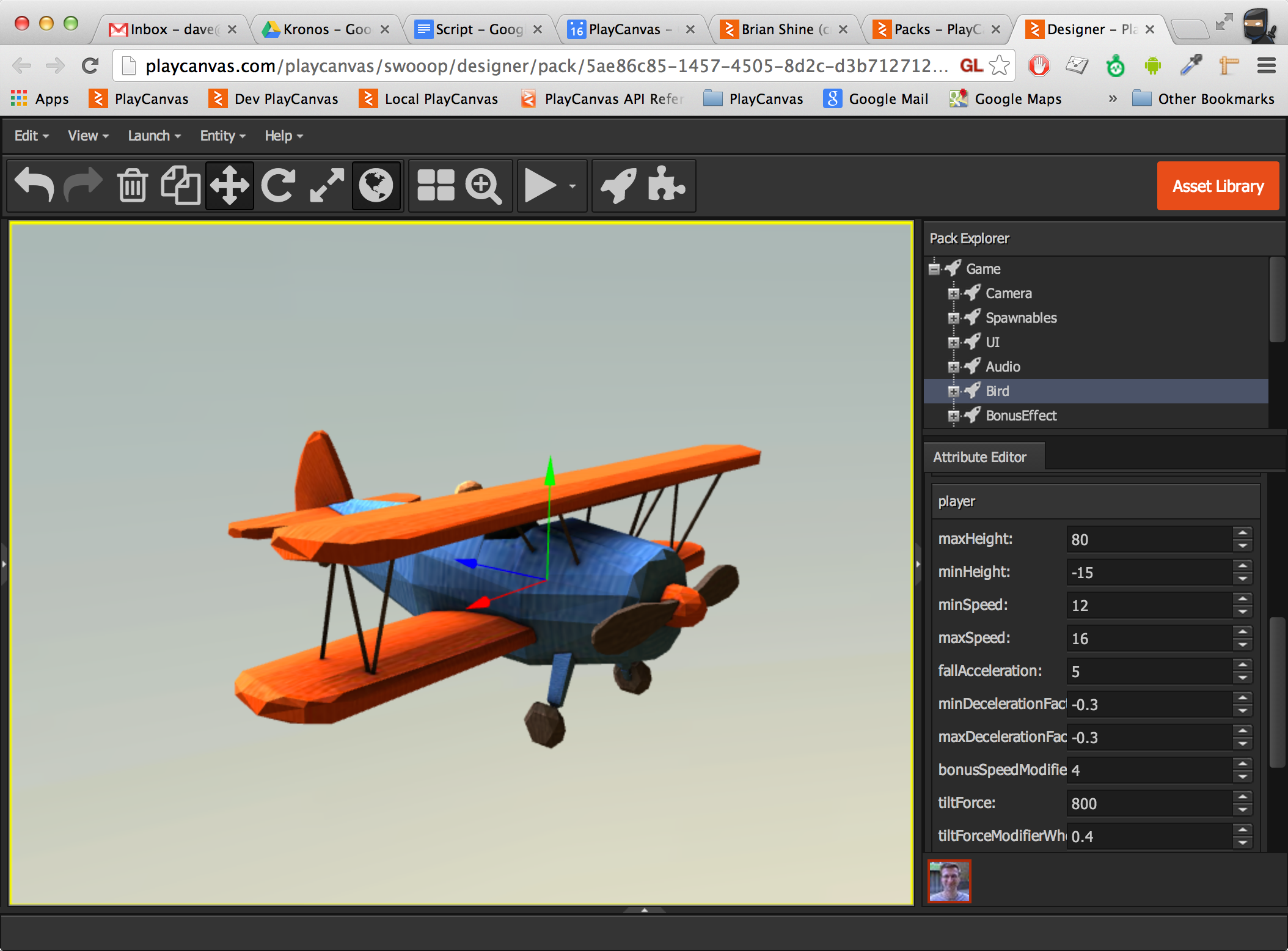
As you can see, it sort of looks like a Windows XP application. If you think it looks retro now, it actually looked retro then! But you can more or less recognize it as PlayCanvas. The Pack Explorer is now the Hierarchy panel on the left. The Attribute Editor is now the Inspector. You can even see the 'Who's Online' bar to the bottom right, which is still around today. We decided quite quickly to drop the WinXP aesthetic by adopting a darker theme in September 2013:
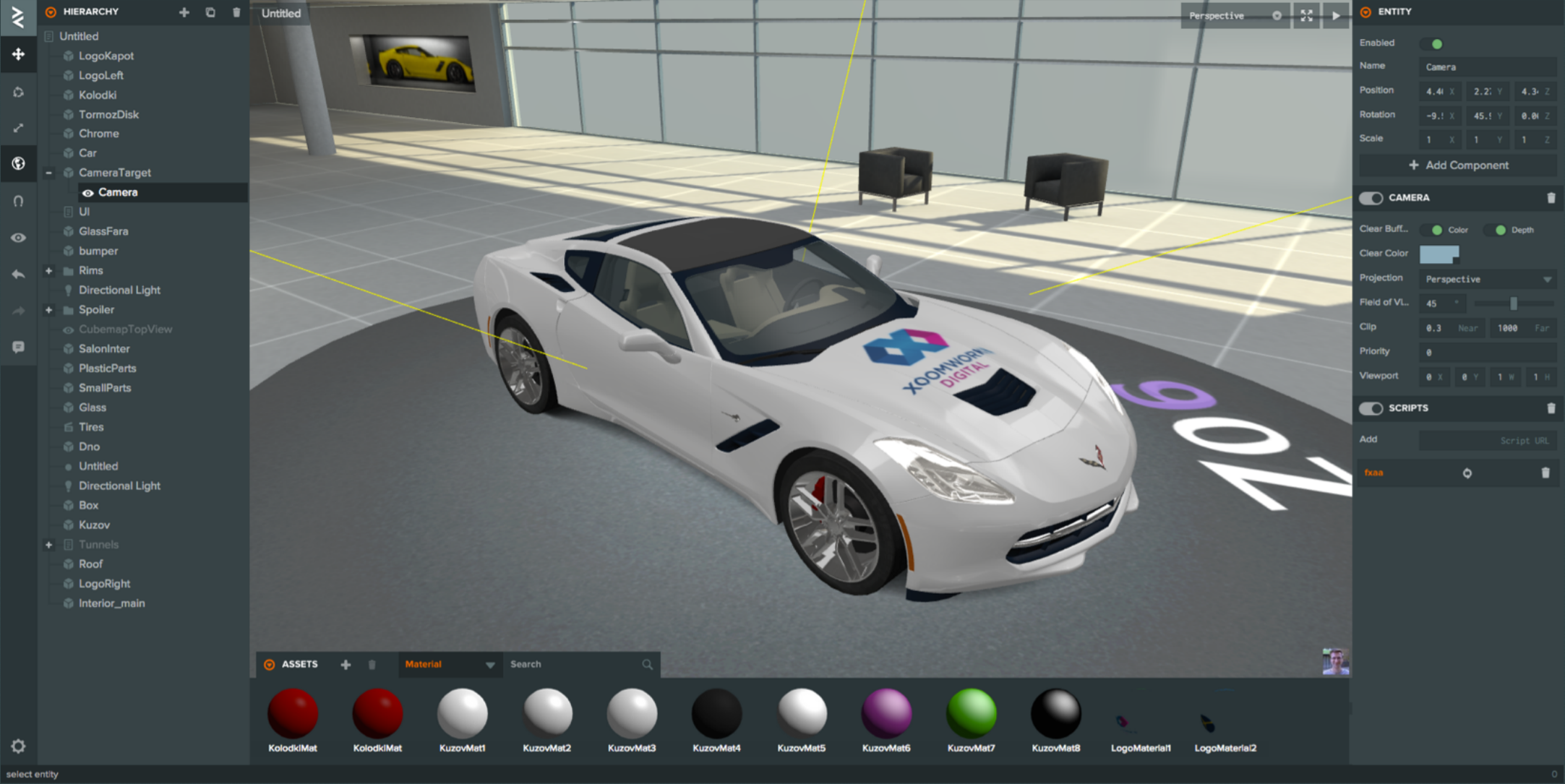
This refresh was definitely an improvement and it was the start of the Designer finding a personality of its own. But after this, the team was struggling to iterate quickly. We took the very difficult decision to throw away the entire ExtJS-based Designer application and rewrite it from scratch using the incredible Vanilla JS framework. And thus, by early 2015, the PlayCanvas Editor was born:
This initial version of the Editor should be much more recognizable. The toolbar and panels are all still in the same location. But today, the Editor packs in far more functionality and is much more powerful.
It was originally written in ES5 and a subset of CSS that would enable the Editor to work in browsers all the way back to IE11. Late last year, we embarked on the next major overhaul for the Editor, with the following goals:
- Create a clean, structured underlying Editor API (more on this later)
- Adopt ES6 (let's get with the times!)
- Adopt CSS grid to make managing the Editor's layout easier
- Refresh and refine the front-end design
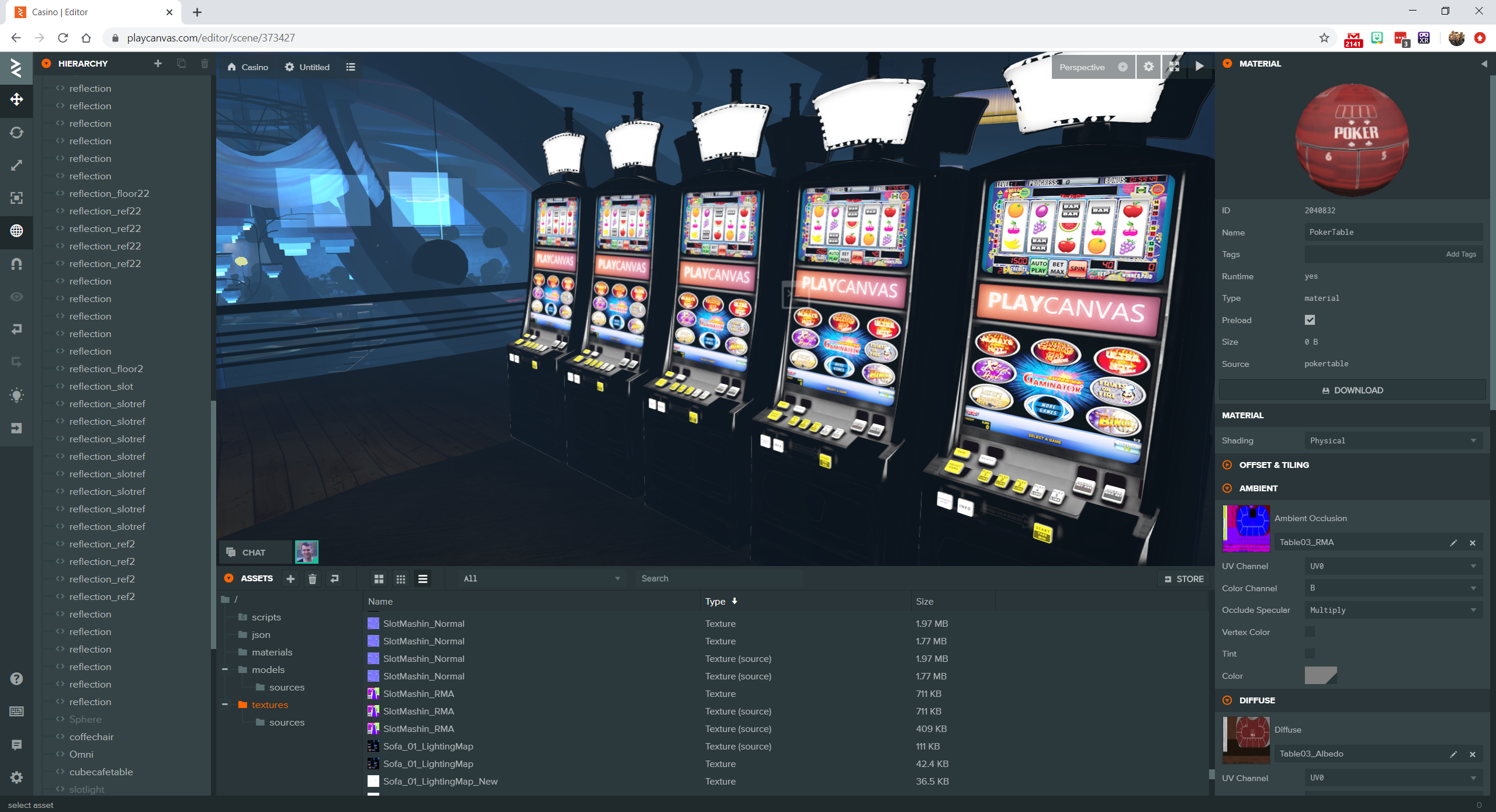
We've slowly been phasing in the new front-end over the last several months, first deploying an updated Hierarchy Panel and then a new Inspector Panel. Today, we're proud to announce the final step in the rollout - the new Asset Panel:
To the end user, the most obvious change is the addition of the Asset Panel's Details View. As an alternative to thumbnails, you can now see a linear list of assets and even sort them on size and type.
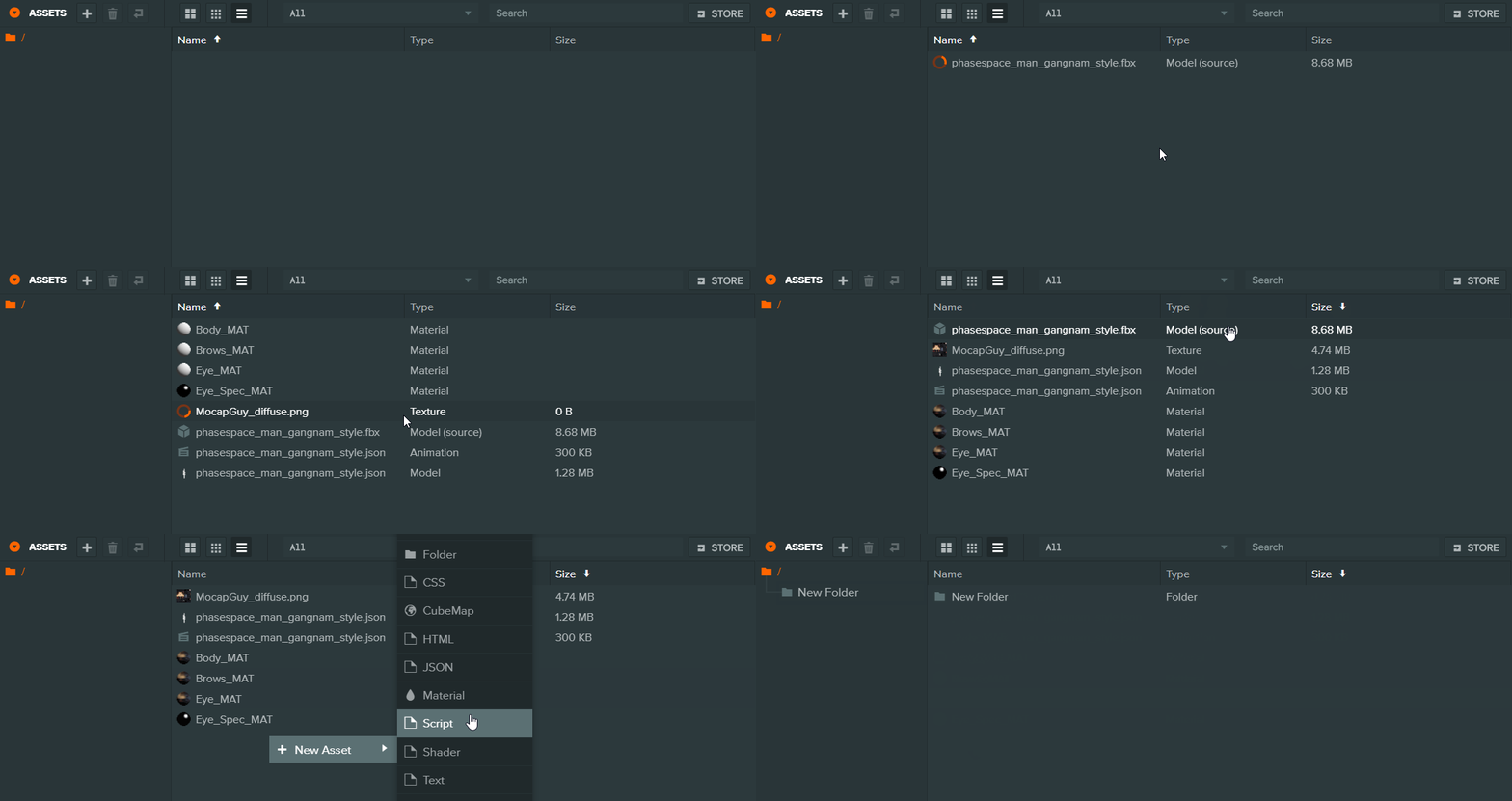
We expect that this will rapidly become the default view for most PlayCanvas developers. No more mouse hovering to read long filenames!
So what's next? Earlier, I mentioned that this completely rebuilt Editor front-end is built on a new, clean, object-oriented API. It is our plan to release this API publicly, once it is ready. This will enable you to write extensions and customizations to the Editor that will culminate in a full plugin system. Stay tuned for further details of that. But in the meantime, let us know what you think by joining the conversation on the forum!

